In Tracy Mulligan’s Game Design Workshop, she outlines the purpose of playtesting, highlighting it as one of the most essential parts of game development (and something that must be done earlier, so that core aspects of the game can be fixed!). Further, she mentions how it shouldn’t be the role of a game designer to dictate to the player how their game should function. Instead, she says, we must set “all the pieces in place” so that a player can have the best experience with our project as possible (Mulligan 3).
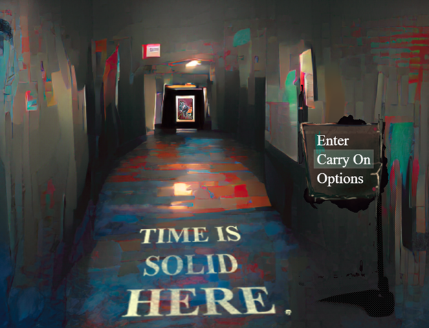
This is what I’ve had in mind while working on my group’s final project, a top-down horror puzzle game named Time is Solid Here.

Following Mulligan’s advice, we started playtesting very early – even when our ‘game’ consisted of a room to walk around in and a painting to interact with. And by playtesting, I mean giving people my laptop, opening up the game, and seeing what they would do without any input. In doing this, I wanted to see if the prototype I made could explain how to play itself without the need for outside instruction.
The answer? No, it could not.
The first time I tested the game, all I wanted to do was for players to interact with the painting on the wall. And though I used the arrow keys and space to play the game when I was playing, my first playtester just used the mouse.
No issue, I thought. There was a system where players could fully control the game using the mouse already implemented. But then they did something that I didn’t expect:
They clicked on the painting. And nothing happened.
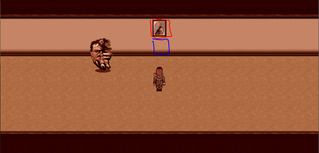
“Of course” I thought. Nothing happened when they clicked on the painting because, to interact with the painting, they needed to interact with an invisible character event that is on the wall tile beneath the painting. In actuality, my playtester should’ve clicked on the tile in blue, instead of the one in red.

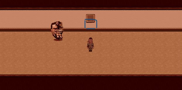
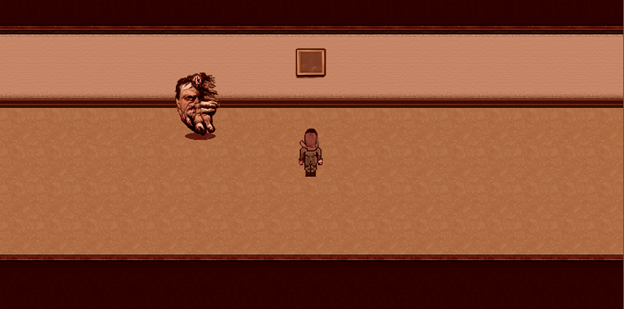
It was at this moment that I realized my flaw in design – players don’t know about tiles, or magical invisible characters in the wall, or anything like that, and nor should they. As a player, it doesn’t make any logical sense to click on the area below the painting instead of the painting itself (in fact, I would be the only one who thinks this makes sense), and my game directly went against Fullerton’s advice by doing this. In turn, I needed to step out of my own shoes and think about what it was like to be a player. My next step was to replace the painting with a custom graphic that not only reflects what the painting actually looks like in-game much better, but also overlaps with the wall tile closest to the floor. Now, when a player clicks on the area they would logically think they should click on, the event would trigger.

As our team developed the game further, I’ve realized this is just one of many oversights I made that would’ve never been found out about without playtesting. There were many times where players didn’t notice animations or events happening on screen (usually because they were too small or blended into the background), and the only reason I noticed them during testing is because I was looking for them.
Hopefully, with Fullerton’s player-centric model in mind, and the lessons I’ve learned from this practice, the rest of our development will go off without a hitch!
Works Cited
Fullerton, Tracy. Game Design Workshop: A Playcentric Approach to Creating Innovative Games. 3rd ed., CRC P, 2014.


First of all, your game? Yeah it’s sick. That is insane and so impressive looking, both in concept and just general like tangibility. Second, what stays with me about this post, is your line that says “…could explain how to play itself without the need for outside instruction”. To be honest, I don’t think there’s any game that I could play that, without instruction, I could just like ~do~, you know? Maybe a first person shooter, because it’s more gun than body, so it’s arguably self explanatory, but even then it would take me so long to figure out which buttons do what and how to use them in a way that the game intends. Maybe it’s because I’m not that video game savvy, but it seems easiest to learn how to misuse a game before you can use it, which is part of why I like your way of testing to see how people interact with it like no instruction just plop here we go. Nice
I appreciate having a look at your game like this: this looks sick!
About your playtesting, I was always of the opinion that games should have some blatant description of how the controls work, besides an experiential tutorial. For example, “Arrow Keys to Move!” or “ESC to open the pause menu.” It provides a basic language for the player to experiment with, and cuts down on a relatively needless trial and error controls testing.
Throughout this course, I’ve been interested in how each game introduces the general controls to the game, and from hearing your experience, it feels as though it highlights the fact that players will tend to take their own past knowledge of playing games into account — and this may not be enough. Going off of Gestalt’s comment, players might need a nudge in the right direction, plus, how you choose to present this information can give you a space for creativity! For example, the instructions might be found within the environment/setting of the game or be provided to you by another character, thereby involving your player in your game-world even further.