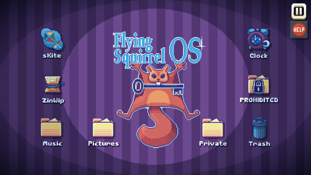
When I started playing There Is No Game, the first thing that caught my attention wasn’t the huge counterintuitive warning signs “Don’t Click Open” “There’s No Game” but how ugly the visuals were (I’m sorry for those who love it but the visuals of this game probably just don’t match my preferences). The strange pixelation (not sickening but enough to remind one of their pixelated nature), an overwhelming “retro” feeling of the main screen that brings me back to the Windows era, and its dominant use of the purple color that is of an even worse choice than Northwestern…my pupil dilated at the red flags – and I only started thinking about what a bratty personality this game embodied with the voice-over and the intended narrative moments later, still unsure if the very ugliness was intended as part of the gameplay.

20 minutes into the gameplay reveals the fundamental power reversal that this game intends for. Despite the petty male voice that constantly shouts out “STOP” and acts as a seeming hindrance to the player, one quickly realizes all his efforts are in fact futile: his own betraying words give the player abundant hints to crack through the levels, and even when one finds the puzzle too hard, there’s always the “pause” and “hints” buttons – flying too bright and clear on the top right corner that they have almost torn away from the main screen – which announces the player’s dominant position in the gameplay. Seemingly mocking the player’s inability to solve puzzles on the surface, the game factually acts like a brat and confirms the player’s power more than any other games I have played before.
Is that what this game intends: to generate a weird sense of satisfaction by reinstalling the player to the center of the power? I don’t feel satisfied at all simply by staring at the ugly color palettes. If this game is about submitting itself to the player, why leaving those weird, tacky picks of color and not-at-all modern screen icons (check out the yellow “Music” folder”, oh god)? Just seems like another mockery to me.
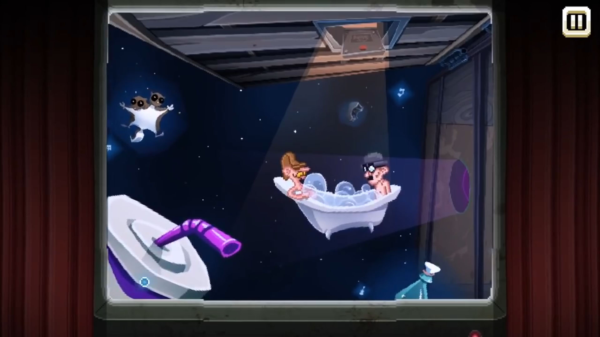
And probably it is. The game, by opening its door to the player in terms of level cracking, mocks us by implicating how much we are already enslaved under digital control: phones, computers, and of course digital games. There Is No Game breaks the shackles that games normally try to cuff on players only to hide the underlying layer of contempt: that the players are already slaves to digital feeds regardless of whether the game restrains their player powers on the surface or not. The old-fashioned aesthetics psychologically bring the players back to a time when the game industry was still in a stage of development, i.e., a stage where netizens may still have had the choice to escape the chains of computer systems. And by touring the player through a variety of gaming universes, each with its distinct and nostalgic mechanics, does this game creates a parallel reality of an old-time revisit? And what does this chance mean – to ridicule or to evoke?

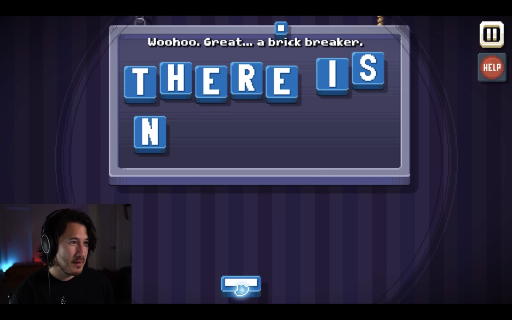
I feel deeply ridiculed even as I type out these words and meanwhile recall the snapping we had at the beginning of the game – where we knock each letter of “There is no game!” one by one off the screen. I feel now not only a slave of games but also words.


I really like your way of tying in how “bratty” and obnoxious the game is — both in graphics and in audio — and how that only further enhances the meta aspects of the game. This made me think about how the mocking tone of the game might not be for the player, but mocking this game genre instead.
I totally felt this too, to some degree. I agree with Katherine in saying I think it’s mocking the genre of game, similar to the meta game of the parodic cow Facebook game we discussed in class