Putting the player character into a haunted mansion, wherein he/she must pick up clues from mystic texts, engage in fights against weird-looking zombies and other monsters, and defeat the ultimate supernatural enemy who strives to host the character in order to escape, Alone in the Dark (1992) received critical acclaim upon release as the first 3D survival horror game. For players these days, this game can hardly strike as being scary but rather quite silly mostly due to the moving objects’ bizarre looks.
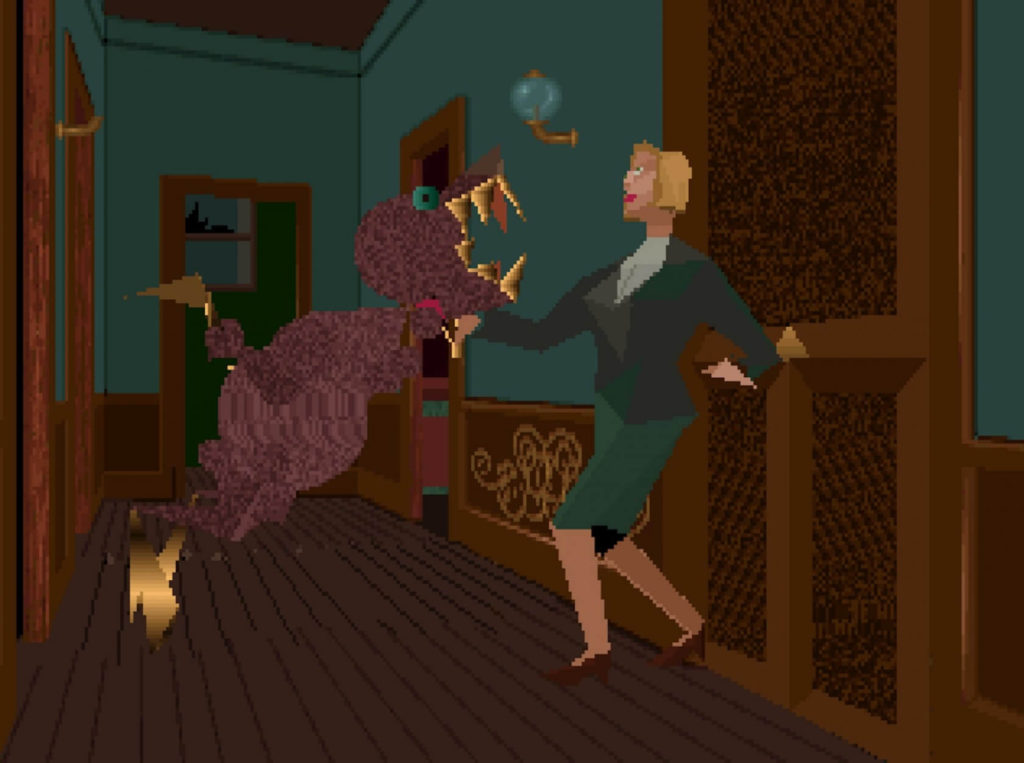
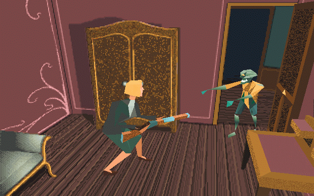
The game offers the player to choose between two player characters: Edward Carnby, a private investigator sent upon the request of an antique dealer; or Emily Hartwood, the niece of the previous house owner who just committed suicide and thus left alone the mansion. To me, both characters differ mostly in terms of their genders and in spite of the different interests each of them represents – for truth or for fortune – their funny looks definitely demand the most attention. Eyes as two tiny black dots, a mouth that never closes, and wiggling running gestures – they may be among the least representative figures that one could imagine for a survival horror game. Monsters in this game share an equal amount of laughable oddness, such as the zombies that appear hardly distinguishable from a melting crap of cake or a clown, or the bipedal poultry with chainsaw-like teeth and a size larger than the human character. The silliness compiles and there is difficulty for one to find a proper scenario that rationally contains the above elements.

Yet aside from the obvious ridiculousness in the looks, this game invested in the character design, top-down camera, and relatively easy combats to create a hero trope – amid the obvious ridiculousness! Swinging back to the front, Edward and Emily always hold their heads high in fancy costumes, putting on airs acting like they are the owners of this mansion. This design spontaneously fits in and oversteps their protagonist identities in this game as seekers and not the first victim of supernatural events. The easy combats also impose no hindrance to the escape. Thus, the top-down camera angle grants the players a God perspective wherein they conquer the game with the proud protagonist who seems to possess no real self-awareness in a relatively easy manner. Those features combined seem to create a hero trope much similar to those we may come across in epic poetries. Regardless of the player characters’ apparent power position as the prey, this game powers them with silly gestures, camera angle, and easy combat as the true hero, or even hunter.

The crappy iconography and the hero trope which is partially constituted of the silliness, some may propose, actually make the game a puppetry, a show that contains too much absurdity that it undercuts its supposed seriousness as the first 3D survival horror game. Yet through the distracting odd-looking faces, awkward character movements, bizarre color patterns, as well as the camera angle and combats that intensified those qualities, seriousness still stands in the game with a massive amount of text interpretation. One has to actually look closely at the folklores and manuscripts by lunatic seekers of the supernatural to properly decipher the true story behind the mansion of Derceto and receive monster-defeating clues. Text reading as such dominates nearly half of the entire gameplay, too much for the player to have an option of focusing solely on making actual puzzle-solving actions, i.e., to get lost in the sillier aspects of the game. After immersing oneself in the dense excerpts, the player may actually find the actual navigation through the game more relieved and purposeful. In a reciprocal sense, the extremely emotional recitation of the excerpts may just seem like intermissions from the silly gameplay. The immense amount of text reading and player control play together to formulate something more than puppetry.
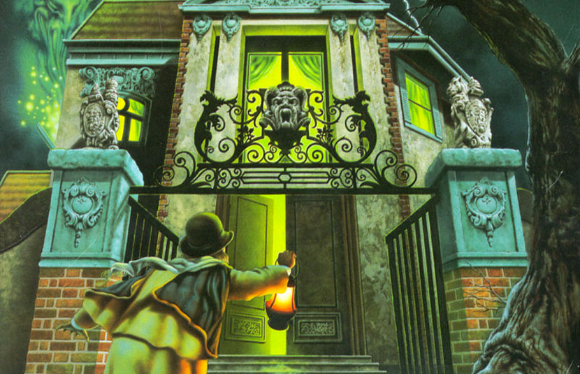
What kind of experience does it create? Its release in 1992 implicates incredible technological constraints – the creators very likely hoped to make better visuals but they were not so equipped to even model 3D surroundings (all the rooms in the game are actually picture layers). The beautiful cutscene pictures demonstrate their awareness of the game visuals – and the contrast between the prevailing silliness that prevails in the player-controlled part of the gameplay and the intense textual inspection produces a theatrical balance that surpasses the theatricality of each. At this point, it seems the creators of the game were well informed of the tech limitations and intentionally used such contrast as a negotiation – to in turn transform such limitation into part of a better storytelling narrative. The limitation now adds onto the theatricality of the game which interweaves with other more silly and formal elements. Can we consider it a successful example of a game’s upfront embracement of its own limitations, in this case a technological one? And where do we go from there?

