In class this week we compared how Curtain and Unpacking tell stories by tedious/annoying aspects of the game. This got me thinking more about comparing how Curtain and Unpacking tell their narratives through the spaces’ aesthetics and the emotions conveyed through that. One similarity that I found really interesting about both games was how the color of the spaces evoked certain feelings or emotions.
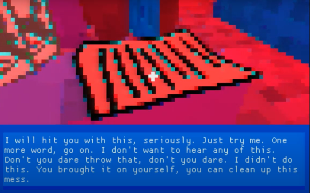
This is much more apparent in Curtain where the first time you go through the apartment everything is in a mix of purples and yellow and when you go through the shower you end up in a time skip where now everything in the apartment is a bright red. I found this to be a great way to convey the difference before and after the time skip. Before the time skip everything is a little too bright and unsettling but the colors are a bit less abrasive than post-time skip and seem to almost blend together due to the pixel graphics. For me, I interpreted this as communicating the main character’s (Ally’s) perception as in this scene she is drunk and so the blurred feeling makes sense to mimic her state of mind. The colors are just bright enough to make you feel uneasy but the purples although not calming are not overly violent colors and this mood of slight unease builds up as the player sees more of the abusive dialogue from the partner (Kaci). In the second phase after the time skip Ally is trying to leave Kaci and the band they were in has fallen apart after Kaci got into a violent altercation with her ex. The whole scene is an argument and the bright red really gives a sense of violence or aggressiveness since red is so often associated with anger. Paired with the dialogue from Kaci it really feels like everything has escalated and is imploding. The way Curtain utilizes colors to contribute to the narrative from by shifting from bright purples giving a sense of unease to bright reds amplifying all of those feelings x100 was something I found the game did really well even though it was a bit of an eyesore.

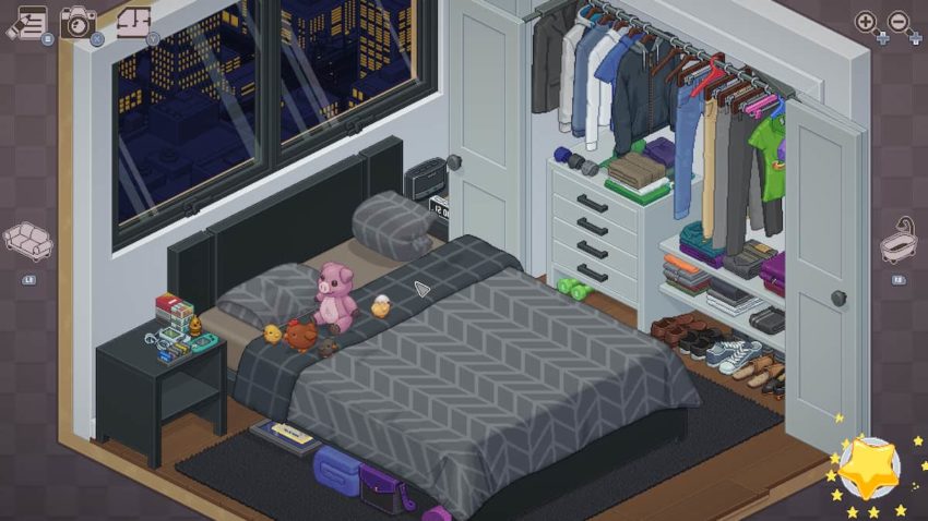
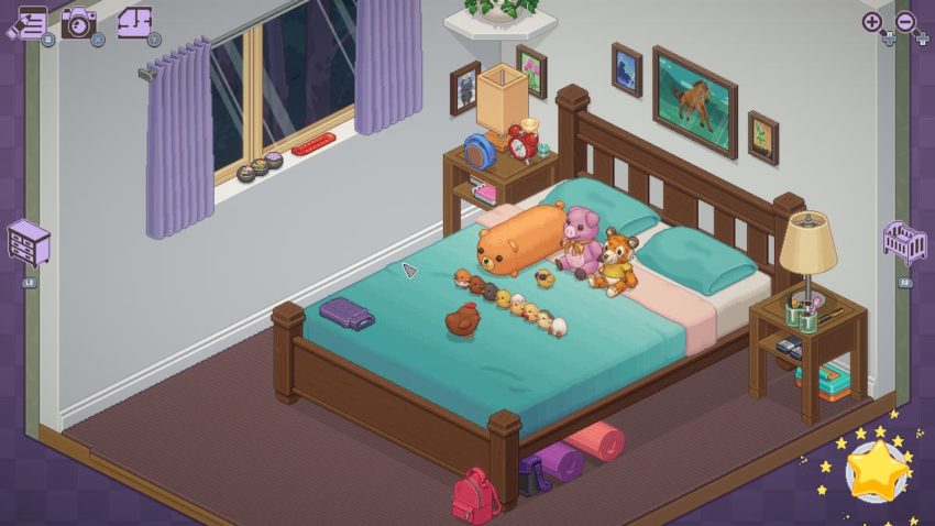
I also noticed that Unpacking used colors to convey feelings or I guess give a better sense of the time and people inhabiting the room. A prime example of this is the 2010 apartment. At this point, the partner moves in with her boyfriend. The space is considerably less cozy compared to her past and future rooms and much less colorful with every fixture of furniture being monochromatic gray with modern aesthetics. For me, this change in palette from colorful and warm accents to this monochromatic sleek design really conveys the sense that her current partner has pretty different tastes or does not feel quite right for the main character. This difference in color choice for this level paired with having to cramp stuff in and barely fit yourself into this person’s life makes the level feel wrong to an extent and gives a sense of the main character’s relationship with the guy. I also feel like the color can also communicate how this relationship affected the main character’s creativity/work as an artist. You see her giving up some of her art supplies when she is with this guy. The grays of his apartment, the seriousness of his objects already there, and the absence of some her art supplies gave me a sense that he might not be as supportive of her becoming an artist or at least that they just don’t fit together due to the clashing aesthetic of their objects. When you get to her 2018 room all the objects are much more colorful the house has wood accents and brighter walls and it gives a sense that the character is in a much more comfortable and fitting relationship. On top of that, the character gets her own office for all of her art supplies. Overall, the way Unpacking utilizes color is a bit more subtle but nonetheless, I do think the color choices of objects, especially the main character’s objects compared to both her ex-partner and current partner show the difference in the relationships.
Both of these games show how color can enhance the levels of a game and convey certain feelings to add to the narrative.
I absolutely agree, and I think this goes even further, with the apartment she gets with her friends and how there, though the colors don’t match in the same way as they do with her second partner, they don’t *clash*, and there’s some parts where they have things in common, like the sewing machine being bright pink and the orange fringe of the outfit on the stand, which shows how they work well with each other but don’t necessarily mesh like her and her partner—and perhaps you could even argue that there’s a notable difference marked there between friend and partner.
Oh, and also the picture for “after shower” is missing from the post.
I definitely resonate with your points here!! I also found Passage’s use of color in its more or less monochromatic sceneries very interesting and pairs with our discussion well here. Though different from the accentuation of details in Unpacking, I do find the color choices used in Passage and Curtain form an interesting contrast in the sense that Curtain heavily highlights the individual subjective perception of the surroundings wherein the backgrounds in Passage do show a combination of both (the coexistence of themes that are more “realistic” or more figurative in the same game).