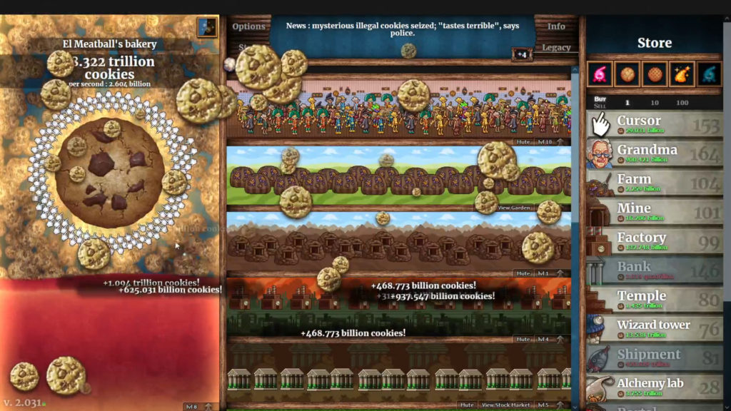
From a UChicago student’s perspective, the world of idle games and mundane simulations was not a great world to explore over my already packed weekend. One game that I particularly had a love/hate relationship with while playing was Cookie Clicker. To my brain, it was a perfect balance of a game that had both visually appealing icons as well as easily accumulable points to a high degree. It was extremely straightforward to play, easy to learn, and it was very addicting to try to reach each level of new items to buy that would in turn allow you to obtain more clicks at a faster rate to buy other high-level items that would achieve the same idea. However, one issue that I faced during the playing of Cookie Clicker was my personal affinity to spend more of my precious cookie clicks on cursors and grandmas rather than higher performing items in order to achieve the visual aesthetic of visually filling out the space versus the cost benefit of buying items that produced more clicks.

Even though it was more economical for me to save my cookie clicks in order to be able to purchase the items that would allow me to earn more cookies per second, I still gravitated towards buying the items, specifically the cursors, that were visually appealing to me. For example, buying the cursors filled out the circle of other cursors surrounding the giant cookie, which created a neat circle. There was no rhyme or reason for me to buy the cursor later on in the game as it produced at a significantly lower rate than the others, and yet I kept on doing it because I wanted to fill out the circle of cursors that was clicking the large cookie. The ability to click on the computer faster than waiting also led to faster personal gratification from the cursors as opposed to the higher-end items. The same applied for my purchasing the farm of grandmas because I kept wanting to buy more in order to have a personal army of grandmas that filled out the entire box of which they resided. It didn’t make any sense for me to continue to waste more clicks on these items, especially when I could save up for later items, but I was constantly inclined to it.

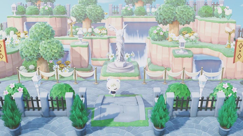
The conflict of function versus aesthetic in game design is interesting to consider, especially in regards to whether the game maker’s original intention was to integrate aesthetic play within the gaming experience. Another game that comes to mind when thinking about extreme aesthetics is Animal Crossing, where the aesthetic of your island sometimes takes precedent over function. Islands are created by players often not for playability or achieving the overall purpose of the game (which in Animal Crossing is paying off the intense amounts of debt that you owe to Tom Nook (crook)) but for visual effect and grandeur, and within Animal Crossing, the décor is mostly nonfunctional. Usually, “Function is the purpose for which a design is developed. Aesthetic Response is a human reaction to the artistic qualities of a sensory experience.” (Interior Design,.3rd Ed). Islands are often created with extreme pre-planning for decorations and theme in mind. Sometimes players will even completely restart their islands in order to achieve the one that suits their aesthetic needs and visions best. The original goal of paying off debt is negligible at that point, the overall goal then becomes how pretty you can make your island look—which further plays into the question of whether the game’s overall purpose then becomes distorted as a result. It’s interesting to see how Cookie Clicker may have unintentionally inserted goals into the aesthetic processes of their game—perhaps it wasn’t their intention at all to make use want to fill out the circle with cursors, but through their aesthetic purposes, it added another layer of challenge and desire for me to personally continue to play this game further.

